Our journey started in 2019 with a simple vision to make city cycling safe. Since then it's been a wild ride developing and sharing REBO with the world, gaining support from the Department for Transport, the European Institute of Innovation and Technology, the Geospatial Commission, Foundation of Integrated Transport, other various local councils and organisations, and not to mention cyclists all over the world!
About Onsee
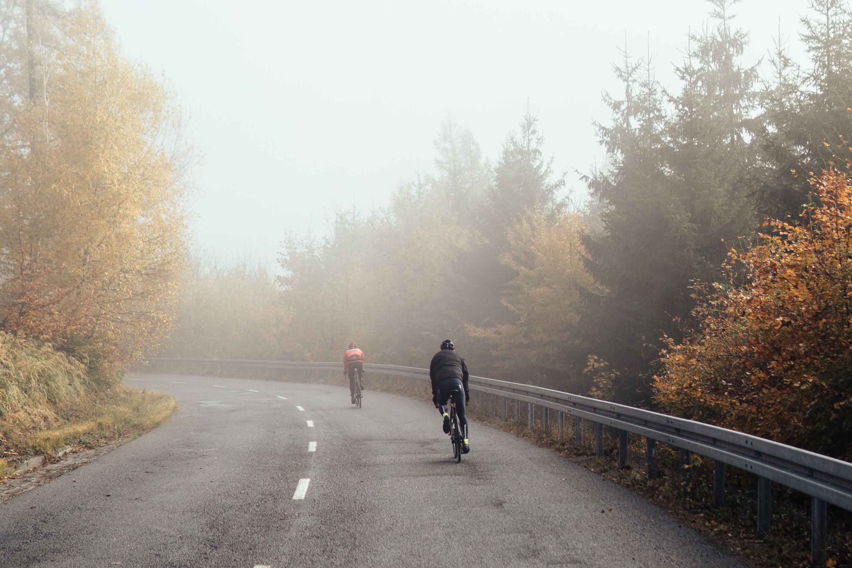
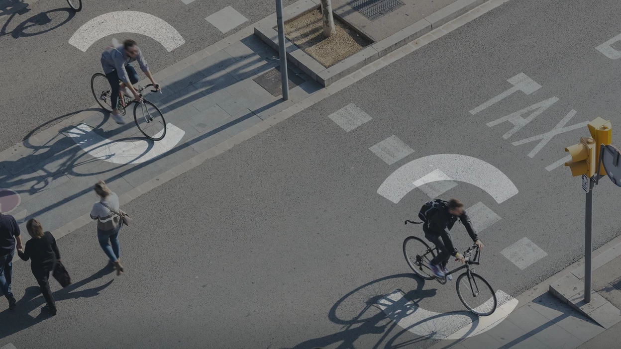
Cyclists are often not seen as legitimate road users. They are vulnerable, exposed, and frequently overlooked by drivers, infrastructure planners, and policy makers alike. We believe this needs to change.
The name Onsee was inspired by the all-seeing eye, a symbol of protection. It represents the idea that when we are seen, we are safer. Onsee embodies the beauty and freedom of seeing the world on two wheels when safety is no longer a barrier.
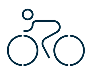
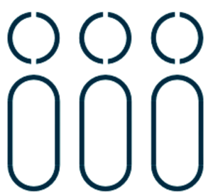
Our Iconic "O"
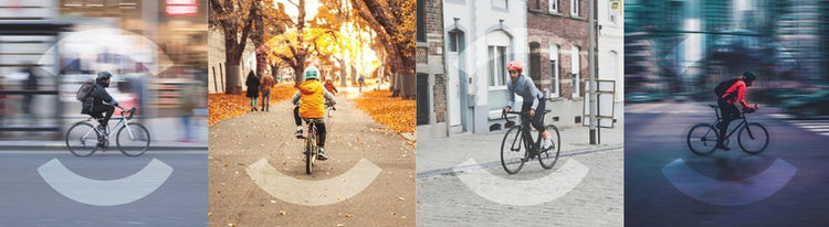
Our brand icon acts as a shield for individuals on a bike. The "O" is more than a letter - it is a symbol of protection, visibility, and community. It represents the watchful eye that keeps cyclists safe on the road.
Our Colours

Our Designs

Our Missions
Enable cycling A-B
Making it safe and easy for everyone to cycle from point A to point B, every single day.
Champion bikes
Advocating for cycling as a legitimate, respected, and prioritised mode of urban transport.
Cultivate communities
Building a community of cyclists who look out for each other and contribute to safer cities.